on
Hello Helvetica!
If you’re a font nerd, you already noticed, if you’re a developer, you have heard it: Apple uses a new system font on iPhone 4. All older iPhones (even when updated to iOS 4!) and the iPad use “Helvetica” as system font but on iPhone 4 you get “.HelveticaNeueUI”. Since both fonts are variants of Helvetica, they differ in details only. However, these details can be of harm.
One of the biggest differences can be seen with the letter “M”. For Helvetica, it is smaller then for .HelveticaNeueUI. If you as developer set label sizes to fit in Interface Builder, it might be that it does not fit on the device. The following pictures show the same app, running in iPhone Simulator once on a simulated iPhone (3), once on a simulated iPhone 4:
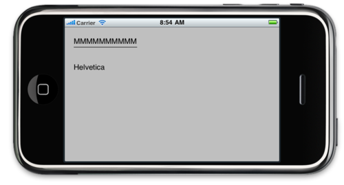
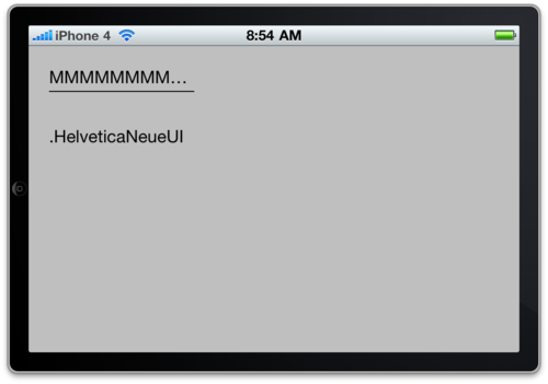
Note the line below the “MMMMMMMMMM”, its width is 142 (the width after Size-to-fit of the label) in both cases.
What to do?
-
Make labels as wide as possible without moving other elements.
-
Test your Apps on iPhone 4. Adjust the interface for iPhone 4, most of the time this is OK for iPhone 3, too.
-
If the iPhone 4 version does not work for iPhone 3, you can use different XIBs or set the sizes/positions of elements in code, whatever is easier.
-
If you used the italic variant of the system font: The new font lacks support for italic. All italic text is rendered as normal (bold-italic is rendered as bold).
Oh, Apple: I like your eye for detail that made you choose a font better for the high resolution display. But breaking old application is not what I’d call a feature …